Theming
Match the payment form to your brand with the theme option.
Pass a theme object to customize the payment form and its card fields.
ic.payment.v1.mount({
  sessionId: "...",
  container: "#payment-container",
  theme: {
    primary: "#7c3aed",
    primaryHover: "#6d28d9",
    borderRadius: "8px",
    textColor: "#111827",
  },
});
Theme examples
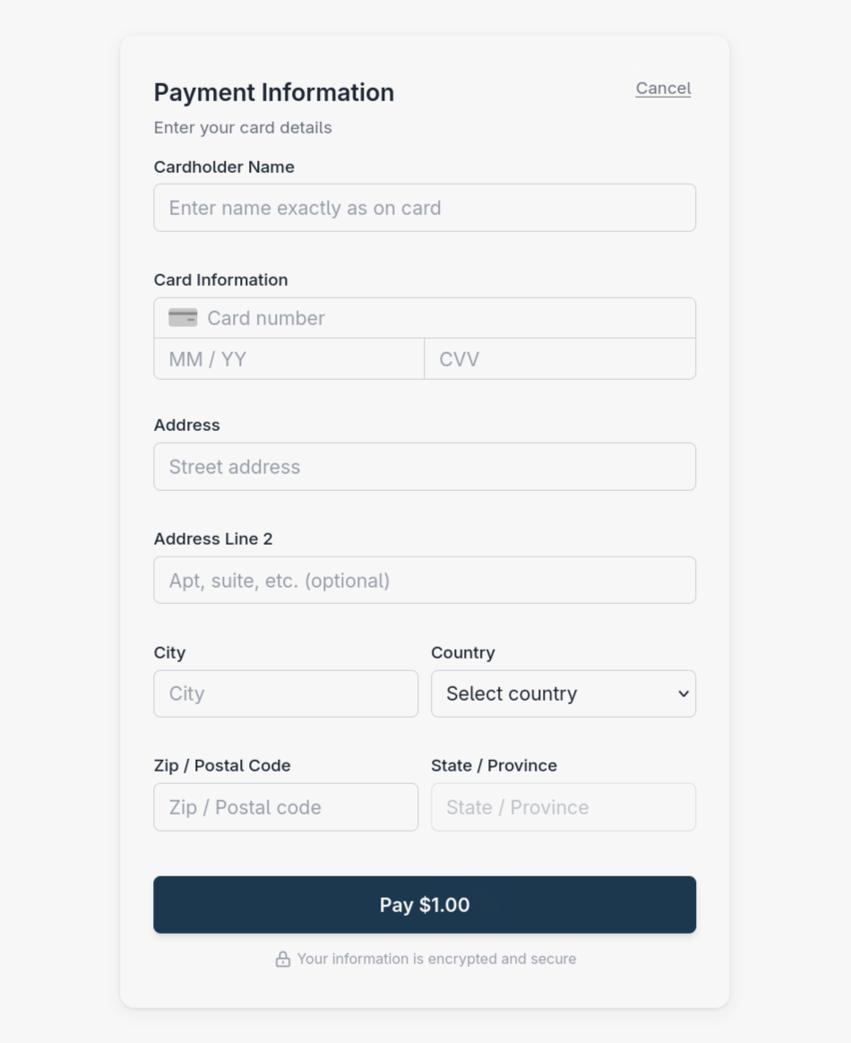
A light appearance for the payment form.
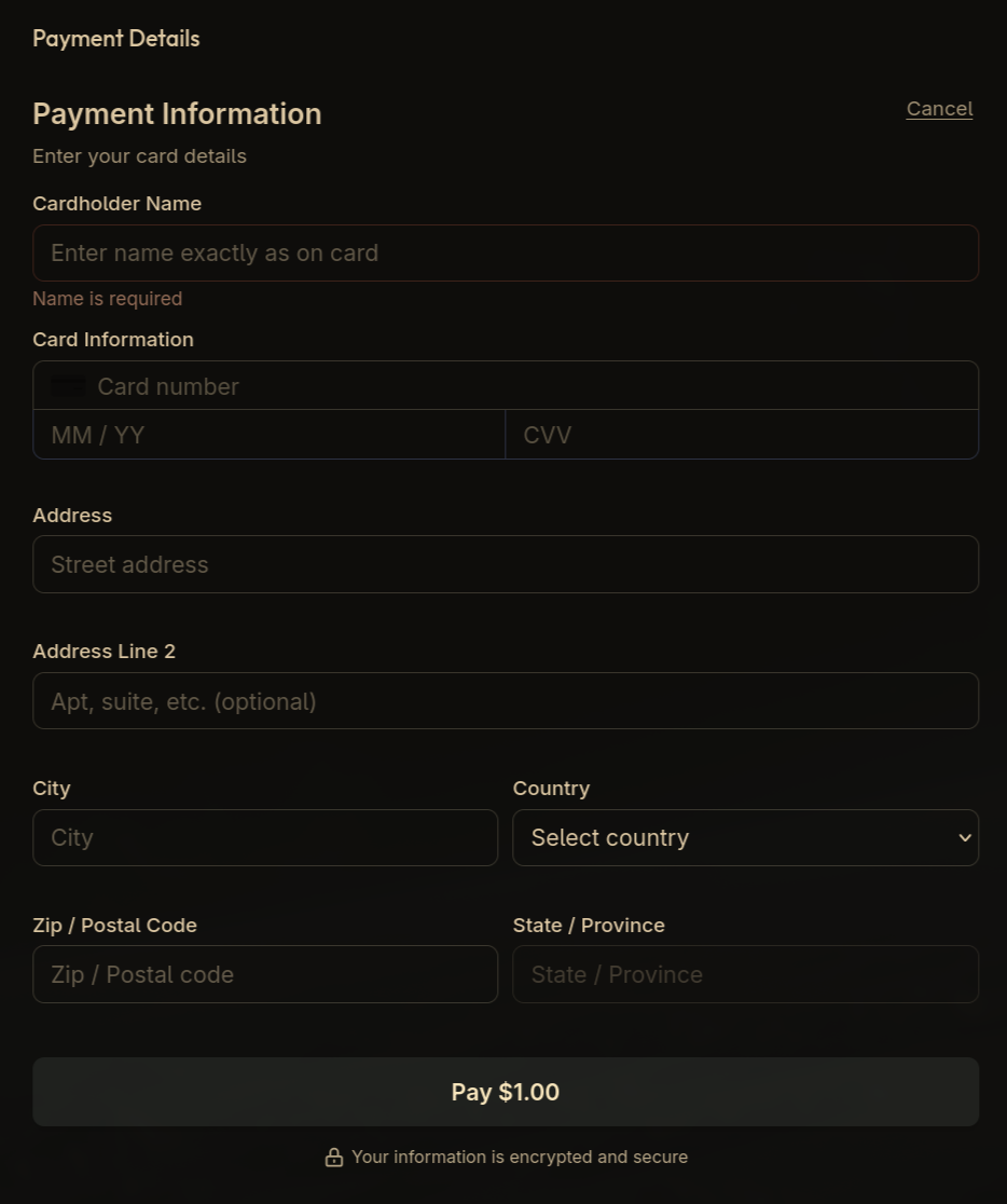
A custom theme applied to a checkout with a dark background.
Why theming is the only styling route
The form is a Custom Element with Shadow DOM, so your page's stylesheets do not reach inside it. That isolation is deliberate: it keeps the card fields visually predictable and prevents your CSS from accidentally hiding or overlaying them.
Do not try to reach into the component with ::part, !important, or DOM traversal. Internal structure is not a supported API and can change between SDK releases. If theme does not cover something you need, contact support@doura.ca.
Accessibility
Theme colours are yours to choose, which makes contrast your responsibility. Keep text and interactive elements at a contrast ratio of at least 4.5:1 against their background - a payment form that a customer cannot read is a payment you do not take.